Reimagining Sputnik’s Brand Identity
In the expanse of the healthcare universe, Sputnik’s surgical lights are like stars guiding surgeons on their life-saving missions. This was the inspiration behind our project. We breathed life into Sputnik’s brand identity. We started by redefining their logo and visual elements, drawing inspiration from the precision and brilliance of their surgical lights, mirroring the advanced technology and innovative spirit of Sputnik.
Skills
Brand identity
Brochure
Presentation
Website
Impact
Effective boost in user experience
Enhanced brand recognition
Client
Sputnik
Date
May, 2023
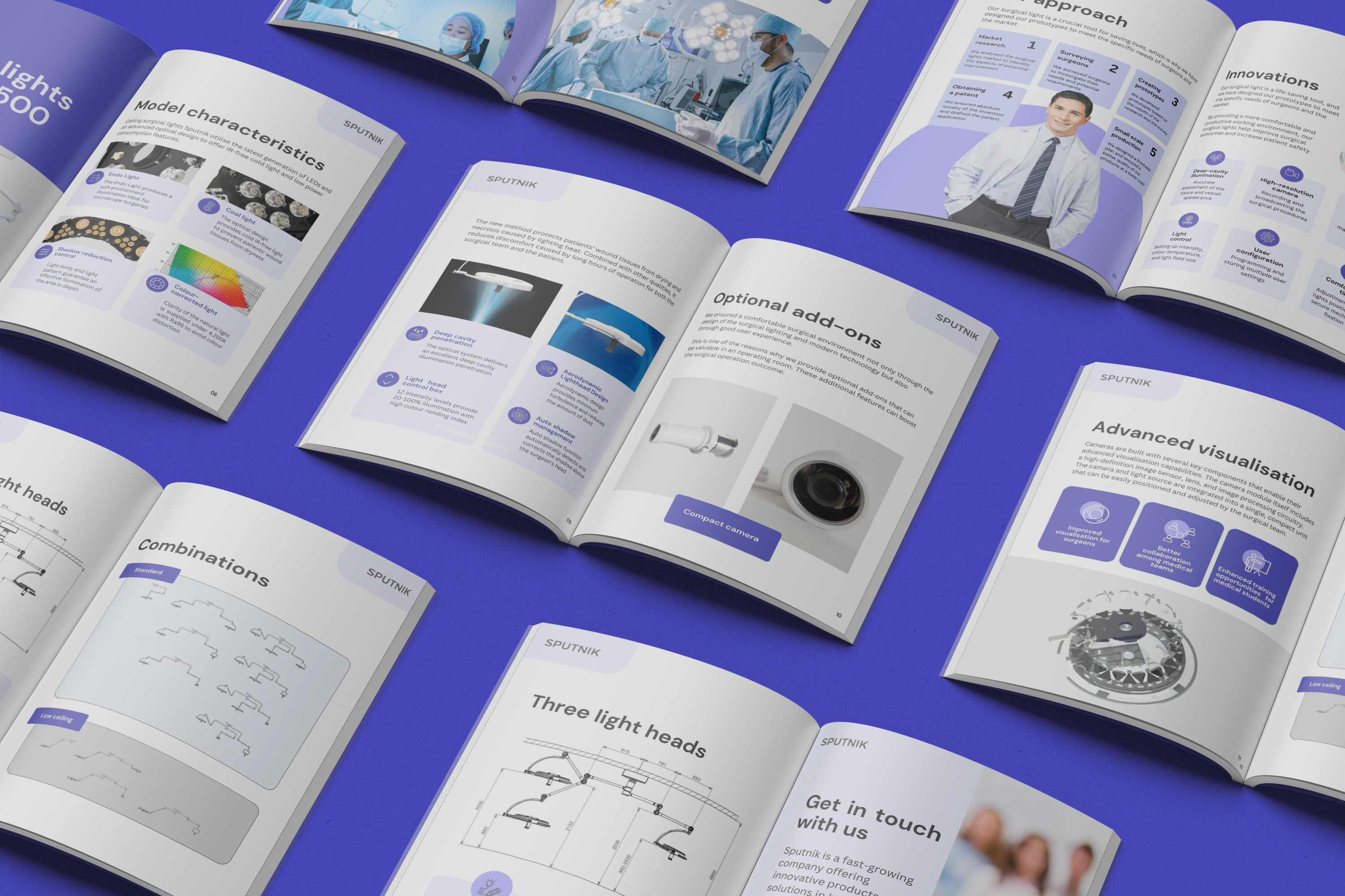
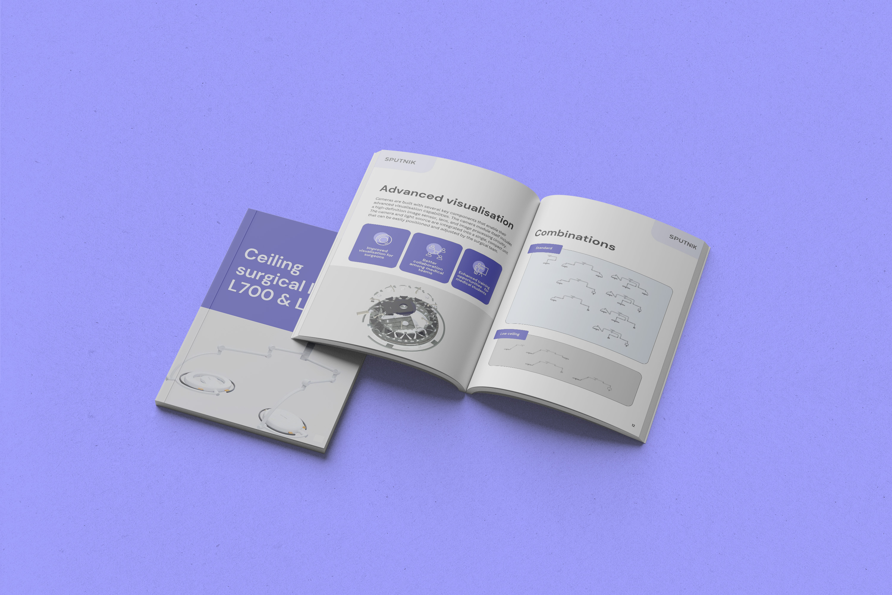
The project also extended to print, with the creation of an aesthetically pleasing and informative brochure. The design mirrored the clean lines and modernity of their brand identity and offered comprehensive details about their offerings.
Nebula’s brochure design.
Sputnik’s Digital Revolution
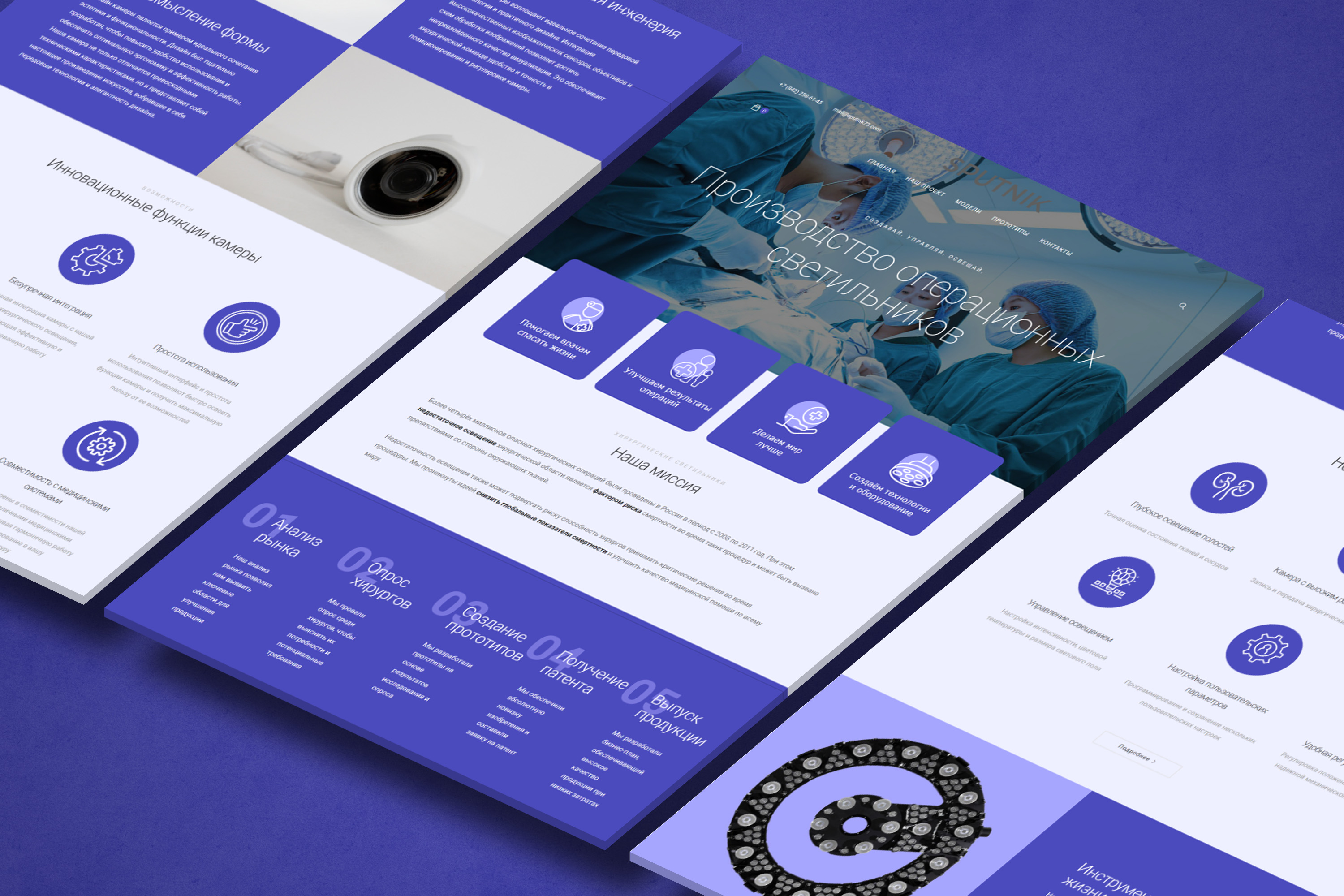
Next, we transformed their digital presence with a complete website rebranding. Our focus was to create a user-friendly, intuitive, and sleek interface that paralleled the brand’s ethos of innovation and quality. We integrated clear, precise, and engaging content to showcase Sputnik’s high-performing surgical lights and their benefits.
In the end the project is not just about rebranding, it is also about a celebration of Sputnik’s commitment to facilitating health and wellbeing. The new branding reflects unwavering focus on precision, clarity, and quality, just like their surgical lights.